1. In what way does your media product use, develop or challenge forms and conventions of real media products?
Before deciding and finalising the song choice for our music video, we had to look at various types of british pop music videos, to inspire and to give us ideas. The Verve - Bittersweet symphony influenced me, as this music videos storyline compared to ours was similar. However, bittersweet symphony has a more simple storyline, which was just a man walking down the streets ignoring all of the distractions. I would not say our music video had a complex storyline because it did not, it was simple. However, compared to bittersweet symphony it had a bit more to it. Our artist Coco Blu was chasing after the man of her dreams (Happy go lucky). The aspects of bittersweet symphony that influenced me was the camerawork. We managed to use most of the camera shots used in the video that influenced me. Such as ; point of view, over the shoulder, long shots, mid shots etc. I think that we did not challenge the conventions of the genre of the video, because our storyline was very simple but at the same time effective. And we made our own new original artist. Here are some screen shots of bittersweet symphony that inspired me, and the shots we used in our video.
Katy Perry - California girls and Mary Popins influenced me, through the use of mise en scene. As you can see i was inspired through the use of animation. As a group, we thought that using animation would be unique, as no other groups thought of the idea and we had not seen this idea in the years before us. I think that it made our music video very effective and vivid, it brings out that vibrant, exciting feel towards it. <<<<<<< Our animation from our music video
I was also inspired by the bright vibrant colours used in Katy Perry's music video, so as a group we decided to use the colourful door to add some light and spark.
I was also influenced by Lily Allen herself, as we picked her song "Mr Blue Sky" as our final choice. However, the song "Mr Blue Sky" was not originally sang by herself it was by the Electic Light Orchestra. Electric Light Orchestra were also a pop group, but Lily Allen made her own modernised version of which we were inspired by. I was also influenced by her CD cover for "Mr Blue Sky" The blue sky with the clouds is the exact images i used, however, i made it into my own original image, by adding the grass and by making it look animatic.
Katy Perry's album cover inspired me because, as seen she has a blue sky on her album cover, which i was aiming for, and i managed to achieve it. I was also aiming for my digipak to be colourful, and for it to stand out. I noticed that the font of Katy Perry's digipak and mine are quite similar, it is curly and it has that quirky theme towards it. The colours that are also used on both digipak's are similar. The colours are bright and they stand out. I was also influenced by Katy Perry as she is a modern artist, aimed at older teenagers, which is our target audience.
As a group we were all inspired by kate nash - pumpkin soup, because of the use of animation.
We were also inspired by joss stone, because of the use of the time lapsed. We used this in our music video as well, which turned out to be a success.
Here is a video of myself talking about what i was influeced by.
1)In what ways does your media product use, develop or challenge forms and conventions of real media products?
When creating our media products we knew as a group we wanted everything to pop out from the crowd. Coco blu to me is not just any typical pop artist, yes she does have some normal conventions of any other female pop singer. But when developing her in our head we envisage something different from the rest but still relateable to her fans. we always knew we would keep our story line basic but wanted to breathe life into it with clever editing and animation.
I thought animation would be a creative and interesting element to include to our video. We spent many hours trying to come up with a way of how we could achieve this. In the end after experimenting with the software available, we processed individual drawings with transparent backgrounds and placed them on top of our own recorded video images. Even though we all had a go at drawing each frame by hand. Only my fellow group member holly was the most successful in doing so. Before we found the right song for our video we watched a range of different style's of videos which we drew inspiration from which influenced our own production.
The main artist that stood out to me personally was Kate Nash- pumpkin soup video. I feel her as an artist is a great comparison to what Coco blu style would reflect. I also felt the video had a Disney like feel to it. The opening of the video includes types of animation which we wanted to have in ours. The bubbles which appear in her video is somewhat the same of what we had near Coco blu head in our video
We used these speech bubbles as a fun interesting way to insulate speech without taking the attention away from the song.
Another video that influenced me was the Joss stone - super love.
In this video again the background is so interesting and captivating, The moving sky is somewhat of a time lapse which is similar to what we include in our video .This drew our attention straight away as our song 'Mr blue sky' had a lot of long instrumentals parts to it that we thought our time lapse along with animation would cleverly fill the gaps.
Here is one of Lily Allen's 1st ever song released by her, as an artist i find her extremely talented and unique which i think helped us in the end pick a song covered by her. Mr blue sky which she didn't release a video for. As there was no original video for the song we choose it meant we could start from scratch and not have the pressure of a comparison. In Lily Allen's - smile video we drew influence for an interaction scene, where she is in the cafe kind of day dreaming while her boyfriend is trying to tell her a story of his day.
We include a scene similar but in an outside environment. I particularly liked the camera work of this clip as it has nice over the shoulder camerawork and point of view shots. which i feel are very important when filming a conversation between two people.
A close up of feet shot that we included in our video.
When it comes to our video i felt we didn't really challenge many music conventions which isn't a bad thing. Our story line is a simple and effective for a fun light hearted pop song. Girl spots guy, Guy spots girl, Guy and girl meet and then live happy ever after. But the one thing i did think we did differently is that unlike pop artist today especial, black female UK pop stars is with her clothing. These days stars like Rhianna or Alexandra Burke are all dressed borderline half naked in there latest videos. But with Coco we wanted her costumes to be well styled sexy but classy. We challenge what most people expect from an artist and gave them something much more liberating and empowering.
When it came to design my digipak and advertisement i wanted it to reflect our artist, i wanted it to be fun and inviting.
I found the Glee soundtrack cover very interesting. As its got that fun feel to it. The colour scheme is some what similar to mines. Also even though the images are small still are very attention grabbing.
2) How effective is the combination of your main product (video) and ancillary texts (digipak and advertisements)
When creating my music video and ancillary products I always tried to have a conscious thought of how they will all connect together. For example our video was filmed in bright and sunshine weather and I knew I wanted my digipak to be bright vibrant colours. As I feel showing a clear link between both products hugely important for a professional look
When creating my digi pak I had many inspirations, in the video below I show examples of a few and briefly explain the things I loved about them .
When creating my digipak and advertisement I knew I needed it to be attention grabbing. That’s why I purposely put a clear happy image of Coco blu at the front of my CD and advertisement. Even though my mock up and final choice differ a little I am ultimately happy with the outcome.The album is called peaches andcream , I cleverly placed the album name text through Coco Blu’s arm which at 1st I was worried about but the use of the right colour made it look ratherattractive. When it came to my CD I wanted to have a countious theme throughout, so that’s why i choose the same background colour and the blue diagonal line between each pannel. At first I did consider having a picture of coco blu’s shoes in the CD holding pannel as I thought this would again show another visual link to our video, especially the opening. But I deiced against it as I thought the broader looked much superior with the album title.
Throughout my production of my ancillary products I made sure there were some clear visual links between them. I feel I have done this well enough for my audience to recognize them and also be attracted to them. The visual links i made are the images of our animations, as a group we created these ourselves so they are unique which is a bonus. Also i kept the Coco Blu in the same outfit throughout all my products which i consciously did so my target audience would notice.
My advertisement with a small image of the Coco Blu album cover from my Digipak.
My album cover from my Digipak with again the Coco Blu banner from my music video
My album cover from my Digipak 'Peaches & Cream' album title is the same font on my advertisement.
My album cover has the same image of the sunshine which is from our animation in our music video.
3)How did you use media technologies in the construction and research, planning and evaluation stages?
From the very begining of this media project media technologies where used in many different ways. The most important part of this project to me was the planning and research process. I used many different types of media technology resources to help me with this part of my project. One of the very first thing we did indivually was to research different female singers and to suss out the main contenders in the music industry. One of the main search engines i used was google which without it i would have struggled as this search engine just makes finding information much easier then any others.
One of the very first website i used was wikipedia, I used wikipedia to search for female British artists i came across a whole page dedicated to this.
From this page i selected artists that i thought were still current to my target audience, and also artists who music was at least vaguely acquainted with.
As soon as i created a shortlist of artist that i wanted to research in detail i used YouTube to find music videos. I could access a large range of different types of videos. I used this website for song ideas from different genrs also. I also used this site to generate some ideas for our music video once we sleeted our song.
another part of our planning and research process was recording some of the information we found. We did this by using the site Blogger.com. On my blog i recorded my findings in mostly text , image and video forms. I found that providing links to videos that we wanted to look at most useful as it saved us time by not having to search it all the time.
Another reason why i found blogger website useful is that we could upload individually but our group could still access it in their own time.
I also used the blog to look a previous years blogs which i found useful.
when it came to the production of our music video we were lucky enough to have access to a brilliant brand new camera, which was state of the art . which used a great memory card storage system. Which allowed us to record digitally on to SD card.which was a very convenient way as we then would use the usb card reader to transfer the files to any computer we needed to use.
The camera had a small digital screen where we could view our footage and also delete any clips we thought we wouldn't need. You could also choose to attach a bigger microphone if the internal mic wasn't picking up enough sound. But we didn't need to use this function. It also had manual zoom which was a handy tool when our auto focus wouldn't work to our liking. As many shots needed this tool.
Another programme we used was Final cut pro. Final cut pro is one of the best editing tools in my opinon and it helped us create our own personal master piece. In final cut pro we uploaded our video footage from our camera. We named each clip so that we knew what was what, and also helped us organise what we didn't use.
Final cut pro has little browsers which shows the clips you select this was very useful in helping us access the clips we needed to view quickly. We could also use these little browsers to arrange our lip syncing perfectly.
We then dragged the clips we wanted to edited on to our timeline. This is an example of our time line. The green bar is our music soundtrack of our song. If you look closely the red markers is what we used to match our lipsynching.
The marker tool was very useful to us. As we used the makers as a guide where we used the razor tool, which enabled me to shorten the length of clips and also separate. This tool allowed us to do this in a very precise way. This tool was most handy when we had to cut our time lapse as it didn't look right. So we had to cut the clip into even smaller clips then had to change the clips speed individually so it would flow right. Final cut pro also gave us the opportunity to add special effects. Now we didn't use many special effects, but we did add a cross dissolve in our opening scene. Once our video was completed we converted the file into a quick time file and it was ready to upload. Below is a video of me briefly explaning some of the main tools i used on photoshop
This video is also our groups animantic storybord our group created back in the planning stages using final cut pro, pictures taken with a digital camera and our sound tract.
4) What have you learned from your audince feedback?
Overall i received very positive feedback from my audience especial target audience. Which i was pleased about as that was the most important thing. Below are a couple of clips from our target audience with their feedback .
I valued both of these audience feedback as its what an artist needs to learn from. I was very glad that my audience picked up on that fact that Coco blu was very different in the way she was dressed. which i think that made her stand out. I'm also glad that the audience enjoyed the short love story line and that the found it was illstrated very well. Im glad our animation came across well as we spent quiet awhile perfecting them.
Here is some more audience feedback where i asked the general question of what the audience think they would want to change if they had a chance
I also recored some audience feedback of my digipak and advertisment.
Im glad my audience like the images of Coco and also the bright colours. When it comes to my advert i wouldn't change anything as i really like the look of it. Maybe my digipak i would add a thank you panel Below is a video where i address the audience feedback and i also discuss what i have learned from the whole experience.
In what ways does your media product use, develop or challenge forms and conventions of real media products?
The .gif above illustrates something really interesting that i'm keen to talk about in relation to ways in which we drew inspiration from existing media. When considering ways to make our film pop out from the crowd we wanted to do something a little different that reflected the attitude of our artist and the genre of the song. I thought a lovely way to do this would be to mix in the computer illustrated and animated with our own footage, much like Disney did in many of their classic films. After experimenting with the software available i came to the conclusion that this would have to be done with individual drawings (with transparent backgrounds) placed on top of footage, meaning each different frame would have to be drawn by hand. This is much like how Disney approached their films so it suited us fine. However it did mean due to time and manpower constraints (that is, I was the only group member able to do this) that we couldn't push this concept as far as i would've liked. However i think it's a fine example of looking to other sources for concepts to develop your own media product, and i was sure to use it throughout the video and the ancillary products. I think by working this tv/film technique into our music video we made the overall product much more interesting to the viewer.
When looking at music videos that might influence our own production we wanted to start with artists that we knew were genre and character relevant, so we looked at a few videos from the likes of Lilly Allen and Kate Nash. Lilly Allen had two videos for her song LDN, The one compared on the left I believe is the original but lesser known one. From this we really got the idea that we could take advantage of our london location and make the most of it by having a video in which the artists explores the city. I think we were pretty successful in this as if you look at some of the interesting streets within Allen's professionally produced video they are very similar to the ones we chose ourself.
The image on the left here is a shot comparison between our music video and Kate Nash's Pumpkin Soup. This just confirmed from us that we could combine small sections of basic animation with our footage together to get the quirky appeal we wanted. Here you see thought bubbles pop out from Kates head and turn into a heart with a cheeky chappy imposed on top the the video. In our own music video we used speech bubbles to communicate yelling without disrupting the song! We also saw Kate Nashs many outfits as very retro and considered her apparel for our own artist before settling on that 50's look.
Finally here's Lily Allens other video for LDN. It's a video in which the artist is moving about the streets which of course was what we were looking to do. I decided the various shot types shown here, the mix between the close-ups of her singing and the long shots of her wondering worked well to communicate her mood fully with body language as well as showcase her singing. So these are the sort of shots we went for in our own video, it's conventional and we don't really do anything exciting here but there's nothing wrong with our approach since it's appropriate to the genre, gives it a professional feel and allows us to utilise the artist to her best to produce the overall feel we want from her.
When it comes to pushing boundaries I don't think we really challenged many music video conventions, which i think is fine for a light hearted pop tune. We have a short story being told, some interaction and in the end she get's the guy and i think that's all how it should be to go with this song! However when i compare our artist to other pop divas (Pictured above, Taylor Swift and Lady Gaga) around at the moment i realise we certainly presented our audience with a new, fresh kind of artist who seems fun and down to earth in our urban multicultural society. I think Coco was a huge success in terms of balancing what the audience want to see whilst challenging their views on what a pop artist should be.
Now as to following digipak and magazine advert conventions, lets take a look at what i consider to be a good example of ancillary texts:
It's clear why this is a successful campaign, for all the reasons i've briefly mentioned in the image. However at first glance it would seem that my own products don't seem to have much in common with this example. Obviously the first thing to consider is the colour palette, i'm quite happy with my choice of colours. Colours are a great way to convey emotion and "feel", above the colours look moody and mysterious whereas for our own album their bright and playful, definitely a good choice as so i feel we followed an industry standard there. You'll notice, in the image above, that the font for the album name and their artist name, are both different but kept the same regardless of which product they're used on, this is also something you'll see i've done on my own products, It helps maintain an artist identity and an album identity. Finally you'll see both my products and those in the image above have branding in the form a logos and industry names, sponsors and record companies and so on. The point i'm trying to make is that two successful campaigns can seem entirely different, as a designer you're encouraged to explore many looks to promote the artist and be creative (I don't think any other posters/albums really influenced my own design), but to make a successful product there will always be conventions that you must follow, and i think i have done so pretty well.
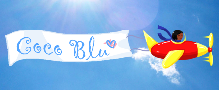


 <<<<<<< Our animation from our music video


 Katy Perry's album cover inspired me because, as seen she has a blue sky on her album cover, which i was aiming for, and i managed to achieve it. I was also aiming for my digipak to be colourful, and for it to stand out. I noticed that the font of Katy Perry's digipak and mine are quite similar, it is curly and it has that quirky theme towards it. The colours that are also used on both digipak's are similar. The colours are bright and they stand out. I was also influenced by Katy Perry as she is a modern artist, aimed at older teenagers, which is our target audience.


 Once our video was completed we converted the file into a quick time file and it was ready to upload. Below is a video of me briefly explaning some of the main tools i used on photoshop


