Group 17
cocobbanner

Monday, 9 May 2011
Friday, 21 January 2011
{Evaluation} Question 4
What have you learned from your audience feedback?
Here's just a couple of clips of audience responses to our video, after watching our music video i asked Toby and Nora (both in our target audience bracket) what they thought was good about our video and what they weren't so keen on:
Good to know that the animations did stand out as we intended and didn't look to poor, as i was nervous as to their quality. This viewer felt that we didn't use enough variety of camera shots and i feel she has a good point, i don't think it was so much that we didn't use enough different camera shots i just feel that perhaps the ones we did use weren't so interesting. If i was to make the video again i would probably think about using more extreme angles and carrying particularly interesting shots throughout the video.
It was really important we got the lip syncing spot-on! So i'm glad this viewer thought it was perfect i don't think we could've done any better in that area. The viewer also pointed out something she didn't think worked to well, the costume, which i think is a shame since we spent a lot of time thinking about artist identity and sourced that outfit specifically, however now that she mentions it i do entirely see her point! The white and dark navy don't compliment the cheery upbeat nature we took through into everything and while i think we got away with it i do think that perhaps that it's a pretty big flaw that would be addressed if this were a professional production.
A different kind of interview below. Taken with a friend, someone entirely unfamiliar with our media course so as to get a genuine unbiased response.
Finally i took the time to show my advert to Nora, above. I chose to question her about it because she fits the bill as our target audience very well so her impression of it was perhaps the most important. I was really please with the comments, she really enjoyed the colour scheme and said it wasn't something she saw working very often which means my advert will really stand out in her mind and she thought the image of coco worked well too. I don't think there's much i would want to change about my advert as the response to it has been really positive. Overall I'm please with the work i've produced.
{Evaluation} Question 3
How did you use media technologies in the construction and research, planning and evaluation stages?
I really feel i have alot to say about the technical work involved, so to save the examiner from a huge wall of text i've decided to address this entirely in a couple of videos, The first below deals with the research, filming and and editing of our music video.
One of the things i feel i haven't covered enough above was technology used in the planning stage, So i'd just like to add a little about that, Mostly the planning consisted of good old fashioned brainstorming and lots of doodling on paper however to help us realise our film we created a simplistic "animatic storyboard" to help us get an idea of the sort of short types we wanted. We did this with a still digital camera and strung together the clips, it's a really handy we to get everyone visualising the same thing.
Next i wanted to look at the technology used in the production of the Advert and digipak, I suggest you view this video in full screen to see clearly what i'm doing but that really is up to you :)
Finally I'd just like to link you to a post i did specifically about using blogs, please consider it as part of this evaluation as i wouldn't want to repeat many things that i have already written about there, Thank you!
{Evaluation} Question 2
How effective is the combination of your main product and ancillary texts?


To look at the effectiveness of my product combinations I put together a video where i just draw attention to a few commonalities between my ancillary texts ad my video (as i feel that's really where an effective result is achieved). My analysis will no doubt be far more thourough in my exam however i feel this will suffice as a demonstration of skills used successfully, We will also get a look at how effective my ancillary media was when i come to answer question 4 of this evaluation concerning audience feedback.
To sum up, I feel i really made the most of using common elements throughout my products to create a brand-wide identity of a sort. My design will not only appeal to our target audience but will be immediately recogniseable to them, even if someone where to know what just one of the artists products look like they would have no problem finding the other. I feel that all my ancillary products looks professional and promotes the artist well.
Thursday, 20 January 2011
Evaluation
2. How effective is the combination of your main product (video) and ancillary texts (digipak and advertisement)?
Overall, think that i done very well on my promotional packages. They have a very clear visual link between them.

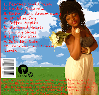
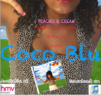
Overall, think that i done very well on my promotional packages. They have a very clear visual link between them.
I made a clear visual link between the video which is the screen shot above and my digipak. And i linked the digipak to my advertisement, by using the same background. I used the same background for my digipak and advertisement because i wanted it to keep to one theme, because using different backgrounds will look unprofessional and unorganised. Which makes it more clear to my audience. I also made a clear link between my digipak and advertisement by using the same font. "PEACHES AND CREAM" is the font on my digipak and "Coco blu" is the font i used on my advertisement. I think the ancillary texts turned out to be a success, because they were already on Photoshop and it is noticeable and easy to read. I made a clear visual link between the front of my digipak and the video, by using the animatic plane, i feel this is the most vivid link, because the the animations are unique and that's what the audience will notice. I think my target audience will by attracted to them because, it has clear visual links. The video, digipak and advertisement are very colourful, vibrant and exciting. The most important of all, is our artist, as she is wearing the same costume in the video along with the digipak and advertisement. There images of the artist costume below.


Evaluation
4. What have you learned from your audience feedback?
I received good audience feedback for both the music video and ancillary products. I was not able to get videos of the audience in the cinema. Here are some videos of our target audience, as our audience were older teenagers aged 16 and above talking, about the links between the music video and ancillary products :
Overall, I have pleased my target audience with my final product. Which is very good and i am proud of. They were able to make clear visual links between the music video and the ancillary products
What i could have improved from my target audience :
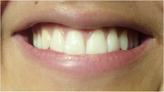
I feel that in our music video at about 2.13, we could have put an effect on the smiles, maybe added colour to make them funky looking and bright. I feel very confident with my advertisement and digipak. Overall, i think that our music video was great, and i had a wonderful time filming and editing.
In my opinion i think that my target audience, gave me honest feedback, i think it was very positive.
I received good audience feedback for both the music video and ancillary products. I was not able to get videos of the audience in the cinema. Here are some videos of our target audience, as our audience were older teenagers aged 16 and above talking, about the links between the music video and ancillary products :
Overall, I have pleased my target audience with my final product. Which is very good and i am proud of. They were able to make clear visual links between the music video and the ancillary products
What i could have improved from my target audience :
- I noticed that from my audience feedback, that i my images on my digipak and advertisement, were cut out quite roughly. But overall, they were able to make clear visual links between the music video and the ancillary products.
- One of my target audience, mentioned that on my advertisement, i could have put on a shadow effect on the texts to make it look more effective.

I feel that in our music video at about 2.13, we could have put an effect on the smiles, maybe added colour to make them funky looking and bright. I feel very confident with my advertisement and digipak. Overall, i think that our music video was great, and i had a wonderful time filming and editing.
In my opinion i think that my target audience, gave me honest feedback, i think it was very positive.
Evaluation
3. How did you use media technologies in the construction and research, planning and evaluation stages?
Through my construction and research, i have used various media technologies, in order to progess to where i am now such as;
In order to conduct my research. I used google, to search artist names, to copy and paste images such as; the record label symbol to put on to my digipak and advertisement and to go to other websites like blogger. I have used google throughout, from my planning to evaluation stages.
In order to conduct my research, i used youtube, to search different artist, genres and ideas that inspired our group to make our successful video. I also used youtube to embed videos onto my blog.
Blogger, was what i used throughout my planning to evaluation. The use of blogger was in order to keep up to date with what i am currently doing during my process. Blogger was very easy to use. Expect it had a lot of problems, such as uploading videos and not playing them, inserting images and not being able to put them where you want them to go. It was very useful as it like a diary.
We used this brand new state of the art camera, to record our music videos on. With the camera we were able to do as many shots as we wanted, and we were able to watch the little clips and delete them if we did not want them. Using the memory cards to store our footage on, this way it does not get lost. The memory card was very large in it was around 16GB, which i thought was enough for filming our music video. After filming we inserted our memory cards into a usb. Then we copied all our footage onto the video drive, this is where everything is stored. With the video drive, everything is bound to be safe .
.
 .
..
Using final cut pro was one of the main part in making our music video, enabling us to put our video together, so it was very useful. With final cut pro, we were able to crop use cross fades, effects and we were also able to put on animation using a drawing tablet, which was a vital part to our final video. With these special effects, it made the video look professional, as this software is used by a lot of media companies today. My group used time lapsed, when editing for this, you have to chop up the clip and make the size smaller, in order for final cut pro to handle it. Although it took time and a lot of work, it became successful. Final cut pro allowed us to insert our soundtrack at the bottom which was locked, so that it would not move. With the soundtrack there, you are able to do the lip syncing in time. At the top left hand corner we selected the specific clip we wanted to use, then we dragged it down to the time line. We marked the specific clip we wanted for the soundtrack, making sure that it was in line and time with the soundtrack. This way the soundtrack would be in link with the video. I think that final cut pro, was easy to use once you got used to it and if you followed instructions.
To produce my digipak and advertisemnt i used Photoshop Element. As we had a choice. I was not too keen on using Quark as i was not familiar with it. As you can see below, you can see my editing process making my digipak. Photoshop Elements allowed me to edit images and make it into my own original one. For example, for the sky and the grass, i got an image from google, opened it up in Photoshop and added an effect on it to make it look cartoonized. And it was successful. Photoshop makes things easier, for example, i used the same background throughout my digipak, so what i did was copy the layers, that way i did not have to open the original image again and start over. I was able to cut around an image, that way it fits onto the background. I was also able to add texts, as you can see on the bakc the track listing. The font that i wanted to use was already on Photoshop, so it made life much easier for me. I was able to change the contrast and lighting of images. And i was able to resize images without stretching them by holding down the shift key at the same time. As you can see on the top, you can see my advertisement. Overall, I think that both my digipak and advertisement go very well together, i managed to keep the colour rule.
Here is a video of me talking about the different technologies ive used.
Subscribe to:
Comments (Atom)


