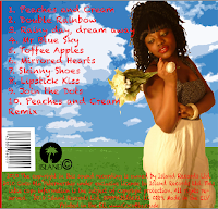
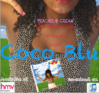
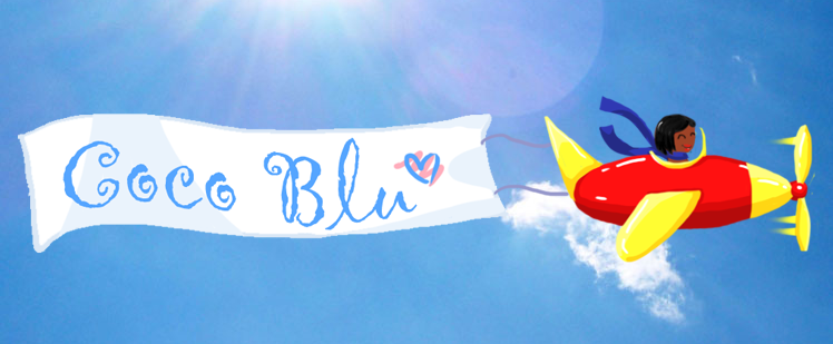
Overall, think that i done very well on my promotional packages. They have a very clear visual link between them.
I made a clear visual link between the video which is the screen shot above and my digipak. And i linked the digipak to my advertisement, by using the same background. I used the same background for my digipak and advertisement because i wanted it to keep to one theme, because using different backgrounds will look unprofessional and unorganised. Which makes it more clear to my audience. I also made a clear link between my digipak and advertisement by using the same font. "PEACHES AND CREAM" is the font on my digipak and "Coco blu" is the font i used on my advertisement. I think the ancillary texts turned out to be a success, because they were already on Photoshop and it is noticeable and easy to read. I made a clear visual link between the front of my digipak and the video, by using the animatic plane, i feel this is the most vivid link, because the the animations are unique and that's what the audience will notice. I think my target audience will by attracted to them because, it has clear visual links. The video, digipak and advertisement are very colourful, vibrant and exciting. The most important of all, is our artist, as she is wearing the same costume in the video along with the digipak and advertisement. There images of the artist costume below.


No comments:
Post a Comment