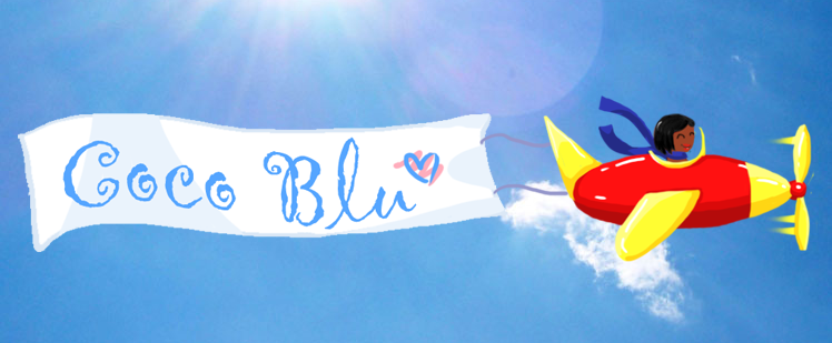
cocobbanner

Sunday, 9 January 2011
Mock up idea alterations and Poster design
Having been given more time to contemplate the digipak i've decided that my mock up, while addressing our needs might be a little bit over-planned, with too many ideas incorporated. I think my design translates brilliantly into a poster or magazine advert but on the 12x12cm of a CD cover it seems a little busy, and in a retail situation it risks getting lost on the shelves so i'm scrapping the idea of using images of the boutique shops along the road, and going to use a closer shot of the figure instead of that long shot of her walking along which will stand out much more on the small scale. Other than that I will be using all the same themes as before, working with the idea of paper cut outs and textures, using the same images/sort of imagery as we used in the animations within our blue skies video. And of course all the notes on colour and font still stand.
Labels:
Holly Grant
Subscribe to:
Post Comments (Atom)

No comments:
Post a Comment